Amanda Wintour, founder of Iron Root Apothecary

About Iron Root

Rooted in strength. Made for stillness.

Iron Root Apothecary was built from the belief that restoration should feel accessible, intentional, and deeply personal.

Founder's mission

Created for the moments when life asks too much.

Founded by Amanda Wintour, Iron Root Apothecary was built from the belief that restoration should feel accessible, intentional, and deeply personal. Each tea, elixir, oil, and wellness product is made to help people create a daily pause without needing a complicated routine.

The brand's industrial-rustic style reflects its heart: strength and softness living together. Every small-batch product is slow processed with care, organic ingredients, and a ritual-minded purpose.

About me

I started Iron Root to make care feel steady, honest, and deeply human. My hope is that every product gives you a small place to breathe, pray, and return to yourself.

"You will keep in perfect peace those whose minds are steadfast, because they trust in you."

Isaiah 26:3

Explore the ritual collection
Amanda Wintour, founder of Iron Root Apothecary

The Story Behind Our Logo

Every part of it was chosen with purpose.

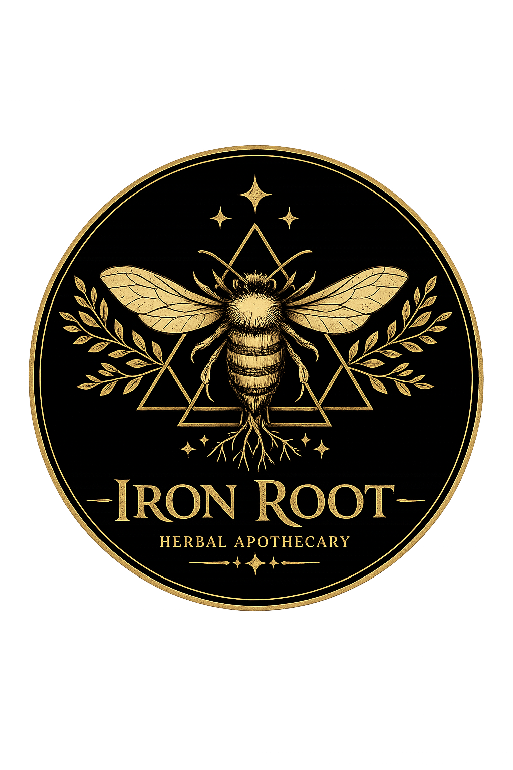
Iron Root bee logo mark

I wanted our logo to feel honest, not decorative. It needed to hold the values behind Iron Root without saying too much at once. The bee stands for diligence, purpose, community, and stewardship. Bees do quiet work, but they make something lasting. That has always stayed with me. They also remind me that creation is something to care for gently, and that small faithful actions can matter more than loud ones.

The roots matter just as much. They speak to healing that begins beneath the surface, to resilience, grounding, and restoration. Growth does not always show itself quickly. Sometimes it begins in hidden places before anything changes above the soil. The roots also carry the name Iron Root Apothecary, because I wanted the brand to feel anchored, not hurried. I wanted it to feel steady enough to return to.

The three triangles are a quiet reference to the Holy Trinity, Father, Son, and Holy Spirit. I did not want that symbolism to be loud or instructional. I wanted it to be steady and sincere, something people of different backgrounds could meet with respect. For me, it is a reminder that faith is the foundation beneath the work, even when the day is ordinary and the work is small.

The circle brings the mark together. It represents wholeness, unity, protection, and the way healing keeps moving even when it is not linear.

Taken as a whole, the logo is more than a brand mark. It reflects a life rooted in faith, grounded in nature, strengthened through resilience, and committed to making room for peace. I wanted every part of it to point back to that same quiet intention, and to feel like something worth keeping for years to come.